The challenge
WeConcile’s primary goal is to create a space where people can learn about themselves within a relationship with a therapist-created curriculum while reaching out to other users in a community to have guided conversations.
People commonly ask for an outside perspective to validate their feelings, ensure they are doing the right thing, or even ask how to navigate a crisis. However, sometimes this can be harmful considering the people you're venting to aren’t professionals who can guide your thought process.
The Solution
Creating a community
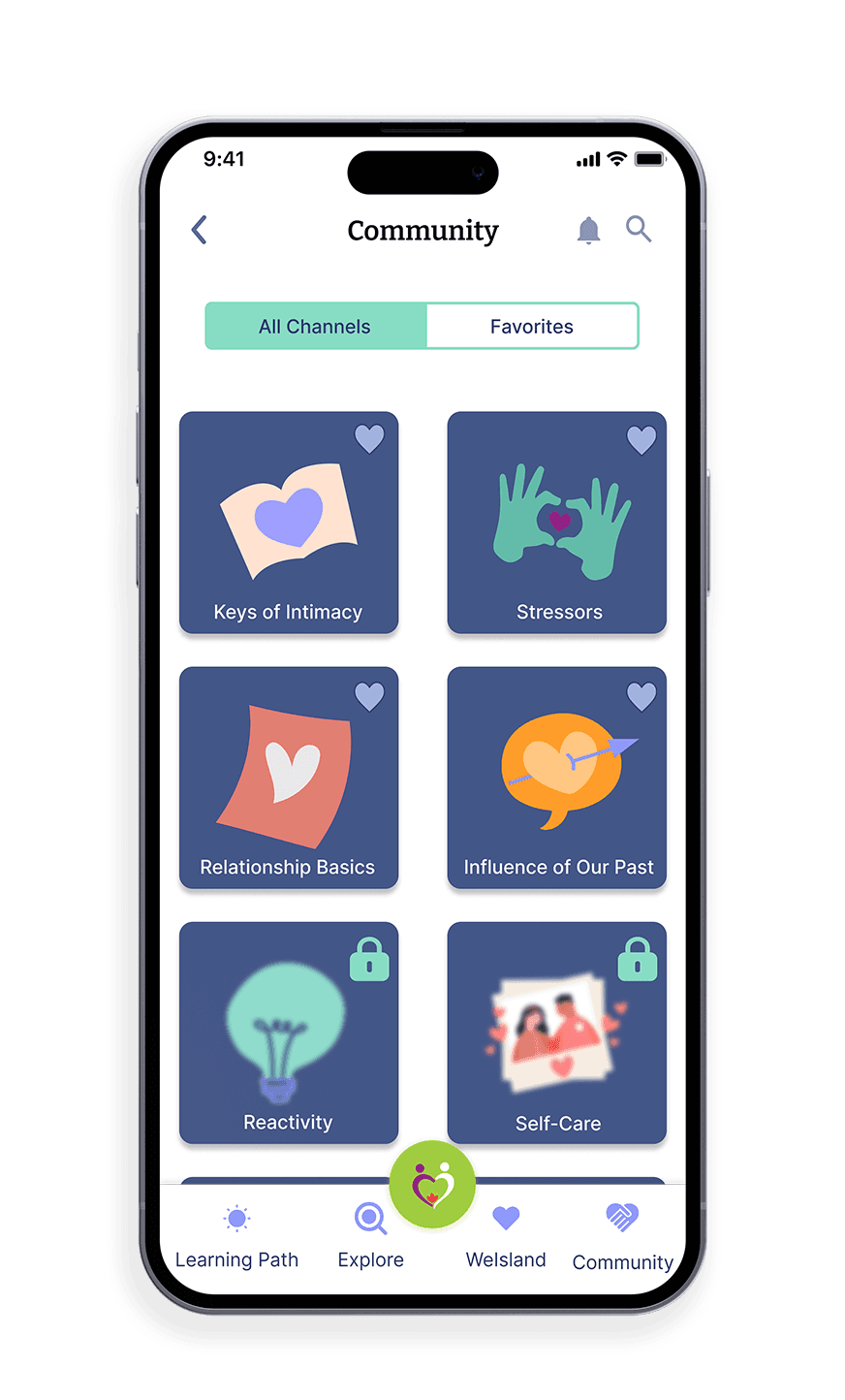
1. Choose your community:
View subtopics that will be covered within the channel
Favorite your most active channels
Unlock more channels as you progress
2. #Enter_a_channel:
Respond, Reflect and Read what others and yourself post
Receive guidance from others who are in a similar situation
Filter, sort, and search through posts that resonate with you
3. Be an active member:
React to and share other's posts
Follow community guidelines to ensure everyone's safety
Grow your relationship
Week 1: Competitive analysis + mapping
What does a successful community look like
To really learn how in-app communities work, we wanted to look at some existing leaders to see what they do best and what we would want to change. The platforms that we chose to look at were Discord, Reddit, Slack, and Facebook Groups.




Slack
Discord
ll these platforms are very successful at providing a means for users to connect and collaborate with others who have similar interests as them. Two of the main features that these platforms have that we want to carry onto WeConcile’s platform are communication and moderation. Open communication and discussion are what we are striving for so that the users can collaborate and learn in real-time from one another, however with that we also want users to interact with one another in a meaningful way which is why moderation is also vital in this case.
How Might We.. encourage communication within the app while fostering a supportive and safe space for users to connect with one another?
Early visualizations
With the user flows and conversations with stakeholders in mind, we began exploring how we wanted the feature to look through sketches.
We wanted the channels to be clearly labeled so that users knew exactly which ones they could access and the correlation between them and their lesson plans. Within the communities, we took inspiration from the industry leaders while adding an extra touch of mindfulness considering this product is therapeutic.
After some iterations and conversations with the stakeholders, we decided on sketches that we all thought were the best fit!
Week 3: High-fidelity mockups
Bringing it to life
In order to stay consistent we pulled colors and icons that are used throughout the app but, realized that perhaps there were too many colors being used making the usability of the app distracting.
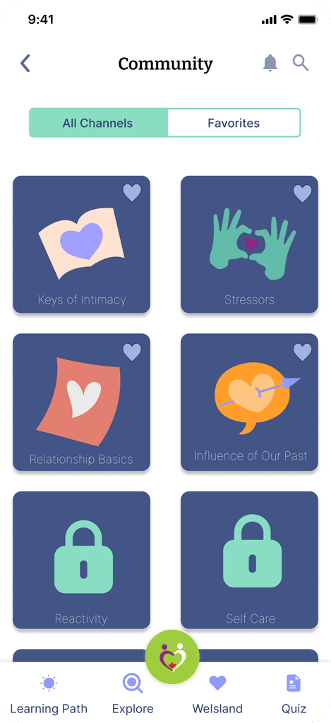
After meeting with our mentors and performing some usability testing our suspicions were correct. Users were spending far too much time trying to figure out which filter they wanted to use as if it was the primary intention of the screen. We needed to make some UI adjustments to the first two screens to ensure that users had all the information they need and that their attention was focused on the main purpose of the community, which was to post, read and reply.
Week 4: Touch-ups and prototyping
Design iterations
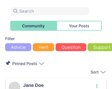
The feature that was most dynamic to change with how we wanted it to look was the filtering option.
At first, we had the option to filter through posts on the main screen of the community you had selected but, through discussions realized that this made it seem like the user's main intent was to sort through what content they want to see rather than just using it as a tool.
Original
Improved
Final
With the other two designs, we thought that it would be better to have the filter slide up after clicking a designated button for it. This way it is not distracting on the homepage and is used more as a helpful feature. Eventually settling on the third one, keeping it simple and clean with minimal color outside of the style guide added.
Final design
The final product
The style guide
Conclusions + lessons learned
Reflection
In conclusion, our group has successfully designed and developed a user-centered community for our stakeholder's mobile app. Through research, user testing, and iterative design, we were able to create an interface that meets the needs and expectations of the users and founders. Our approach was collaborative and we worked together to ensure that every member of the group had a voice in the design process. We also made sure to follow best practices in UX/UI design, including accessibility and usability standards. Overall, we are proud of the outcome of this project and believe that our design will enhance the user experience and contribute to the success of WeConcile.
Overall, I hope to take the lessons that I learned in this project to help me towards more productive and empowering design in the future!


